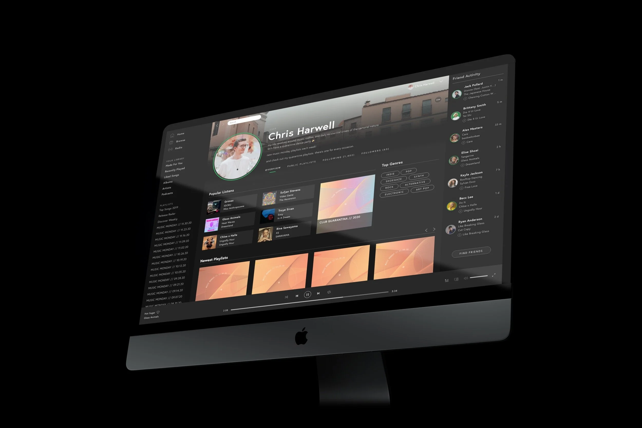
Case Study \\ Spotify
Spotify is one of the world’s leading music streaming platforms. It hosts beloved, personally curated features like “Release Radar”, “Discover Weekly”, and personalized end of year round-ups summarizing users’ activity for the past year. But is Spotify considered a social network? Interestingly, rumored upcoming features indicate a shift towards elements more in-line with social platforms. So, what exactly would a more socially-oriented Spotify look like?
Reimagine Spotify’s desktop interface as a music streaming platform/social network hybrid experience.
// The Goal
With Spotify showing an increasing shift towards developing new social features for the platform, it’s the perfect time to redesign Spotify’s experience and UI to incorporate new designs and elements aimed at increasing interaction within the platform.
// Current Events
While Spotify doesn’t appear to be turning into a full-on social network any time soon, the development of some upcoming features will surely raise some eyebrows and almost certainly increase engagement within the straming network.
Spotify Stories (Influencers)
Already an active feature for some of Spotify’s most popular influencers, Stories allows users to post short clips to their profile. Although they fall in the same category as Instagram stories, they are primarily designed for users to highlight playlists and share clips of their favorite songs.
Tastebuds
Designed to allow users to explore their friends’ taste in music, Tastebuds is a rumored, yet-to-be-released feature. The feature is centered around music discovery and aims to allow users to discover new music through people they think have great taste.
Spotify Wrapped
Since 2016, Spotify has offered users a look at their music listening stats at the end of each year. The feature highlights each user’s top songs, albums, genres, and listening stats for the year, with many users choosing to share their stats on social media.
Considering these new features, how can Spotify be redesigned or updated to offer a more cohesive social experience that increasingly engages users within the platform without compromising Spotify’s core, music streaming identity?
// Research
How social is Spotify currently? Let’s check out some of the existing social integration within the platform.
// How Social is Spotify?
Not very.
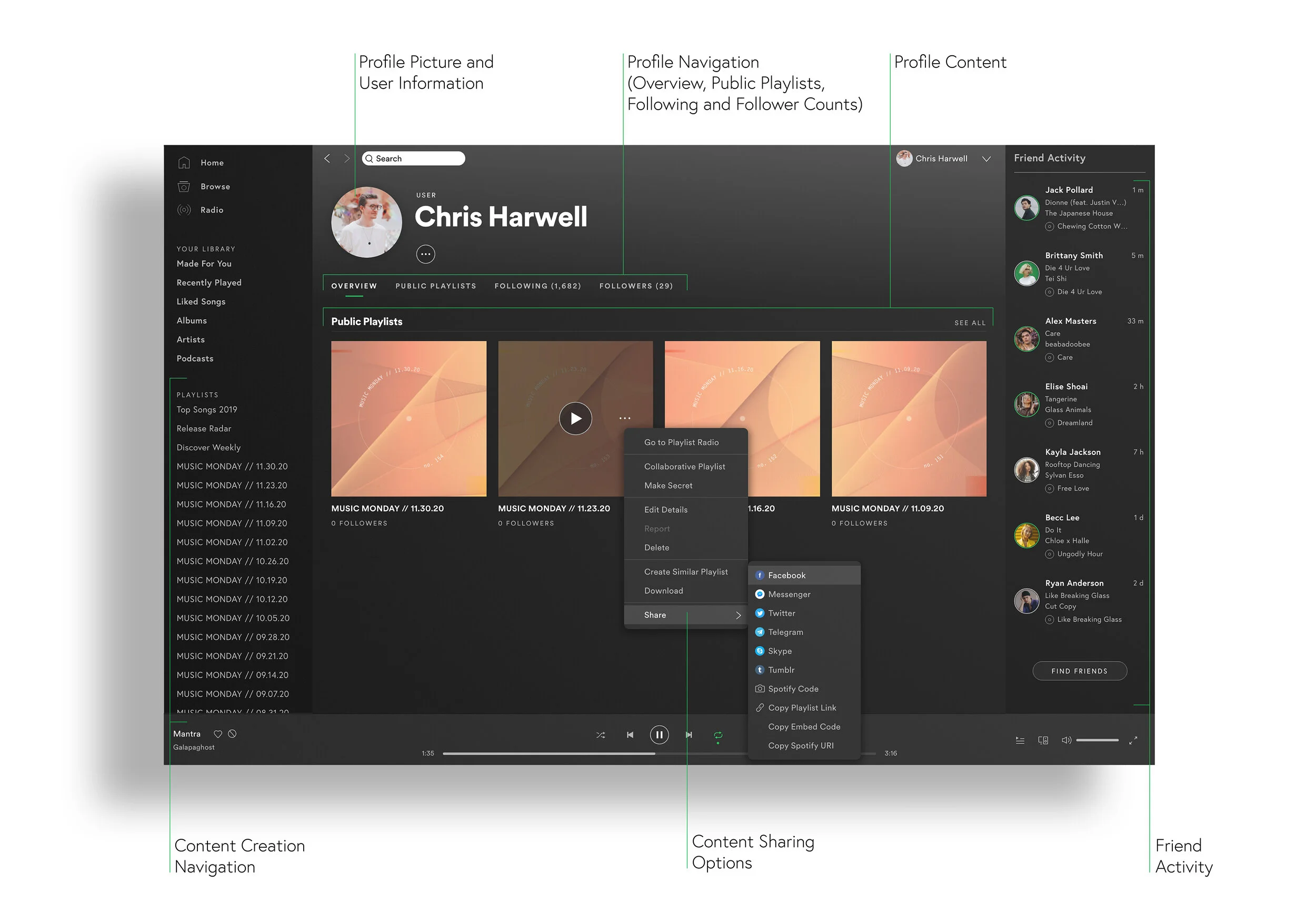
When compiling Spotify’s sitemap, it becomes obvious that social features are few and far between and reside almost exclusively within the Profile page.
The “Share” feature (which integrates with playlists) can be found anywhere content resides on Spotify, but requires a third-party app to function.
Profile Eval.
Profiles offer a mild level of social function through profile navigation showcasing follows, followers, and personal playlists.
The profile picture can be changed, playlist art can be customized, and personal creations may be shared.
Friend Activity resides permanently in the right-hand navigation bar.
// Existing Social Elements.
Personal Profiles.
User profiles are able to showcase public playlists, followed artists, and users’ followers. Some customization is allowed with profile photos and a toggleable recently played artists tab.
Pros: Personalization (playlists, photo)
Pains: Minimal customization, No control over tab display/organization, Limited written personalization
Friend Activity.
The “Friend Activity” feed shows users what their friends’ and favorite artists are listening to. From there, they can be linked to songs, albums, and playlists to find new favorites.
Pros: Curates music discovery through trusted networks, Adds dimension of fun, Provides direct links to artists’ music
Pains: Feature is glitchy (doesn’t always display properly, difficulty adding new friends)
Sharing.
Spotify’s platform empowers users to share their favorite music through social networks. The mobile app offers additional sharing options through text messages and popular mobile-only apps like Snapchat.
Pros: Facilitates music discovery/streaming through social engagement
Pains: Sharing limited to third-party platforms
// Users
Who is using Spotify’s existing social features? How can we expand the experience to better suit their needs and entice new audience members to share more music through Spotify?
// Let’s Get Personal.
The Influencer
Influencers are social networking masters. They’re constantly looking for new ways to gain followers and engage with their current fans to maintain their status as trendsetters, attract new business partnerships, and continue developing their personal brand.
They want to see increased personalization to align their profile with their brand identity, as well as increased discoverability to expand their audience.
The Melophile
Melophiles are true music connoisseurs. They love discovering new music, supporting up-and-coming artists, and sharing their finds with their friends and social networks.
These music lovers want to have more control over how their extensive playlist collection displays and easier discoverability of their curated content for people looking to find their next favorite band.
Although they may be motivated for different reasons, both users desire increased personalization and discoverability. Redesigning Spotify User Profiles to display more content and utilize existing personal data (e.g. Spotify Wrapped) would provide the greatest impact without requiring immense effort, all the while evolving the Spotify User Experience without compromising its core identity.
// Ideation
Understanding who’s going to be taking advantage of a more socialized Spotify, let’s start redesigning the layout and features available to general users.
// Profile Iteration.
Personal Touches
Initial exploration expanded into the most basic feature of social networks: personal info. The profile photo became a more prominent feature and optional features like stories (green ring), an about me section, and a customizable background photo were added.
Content Blocks
Social networks have content management features that allow them to provide personalization while adhering to a standard format. Adding content blocks gives users greater control over organization and content display.
Popular Content
We’ve reached the generation that doesn’t remember Myspace allowed users to feature their favorite music on their profile. Cue Gen Z asking for that feature on Twitter. Often. Adding it to Spotify makes sense and helps promote artists’ content.
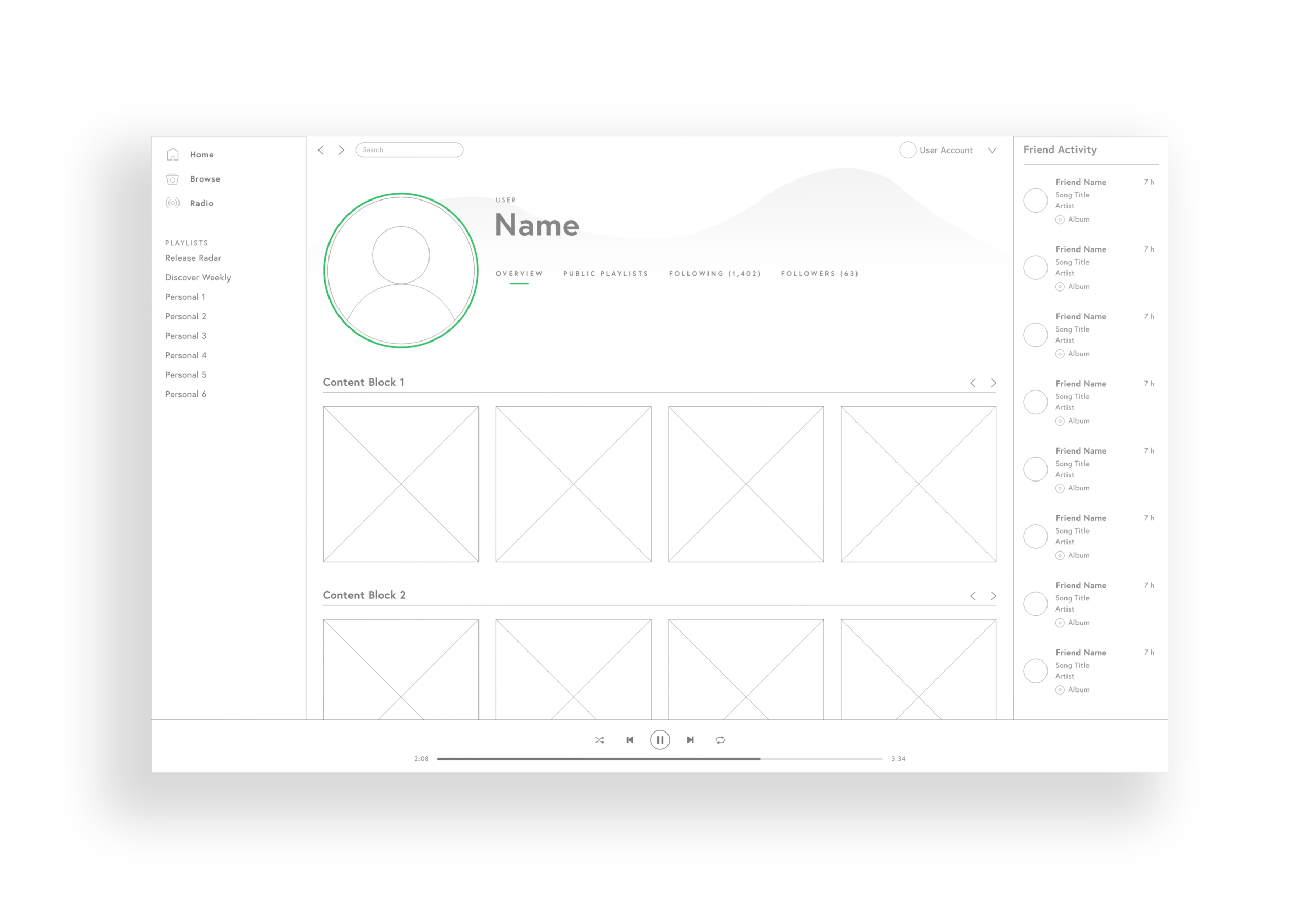


//Refinement
So, what exactly would content blocks look like on your profile page? How would they look with each other? Let’s take a look..
// Show Your Personality.
Personalize.
Choose the content blocks that show off your favorite tracks, albums, and the care you put into creating personal playlists.
Socialize.
See who you interact with most on Spotify and be a click away from your best friends. See what they’re listening to or share a new song you just discovered.
Inform.
Broadcast your taste. Let everyone know your top genres to get an idea of who you are and let them see how cool you are just by the songs you play.
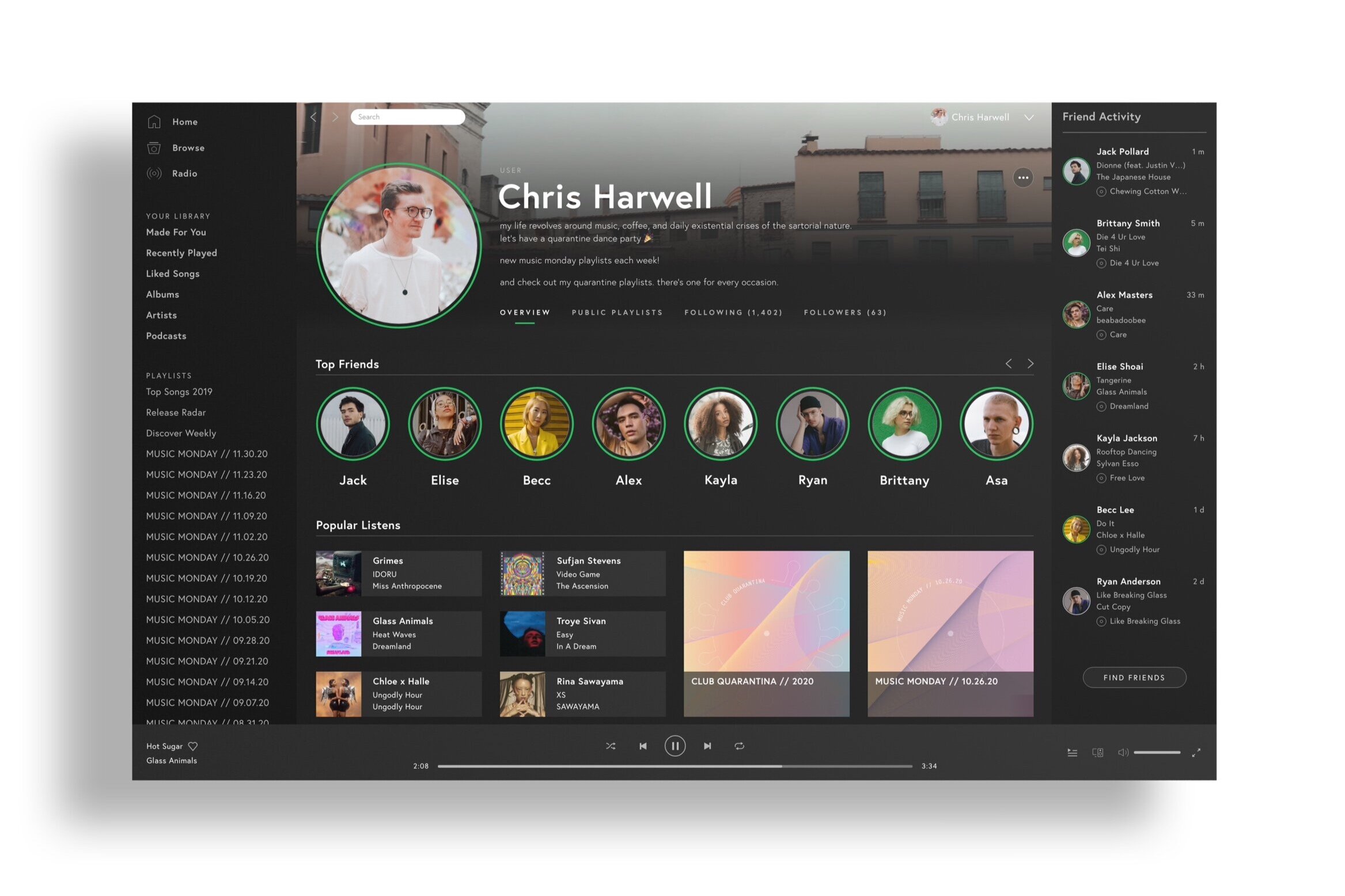
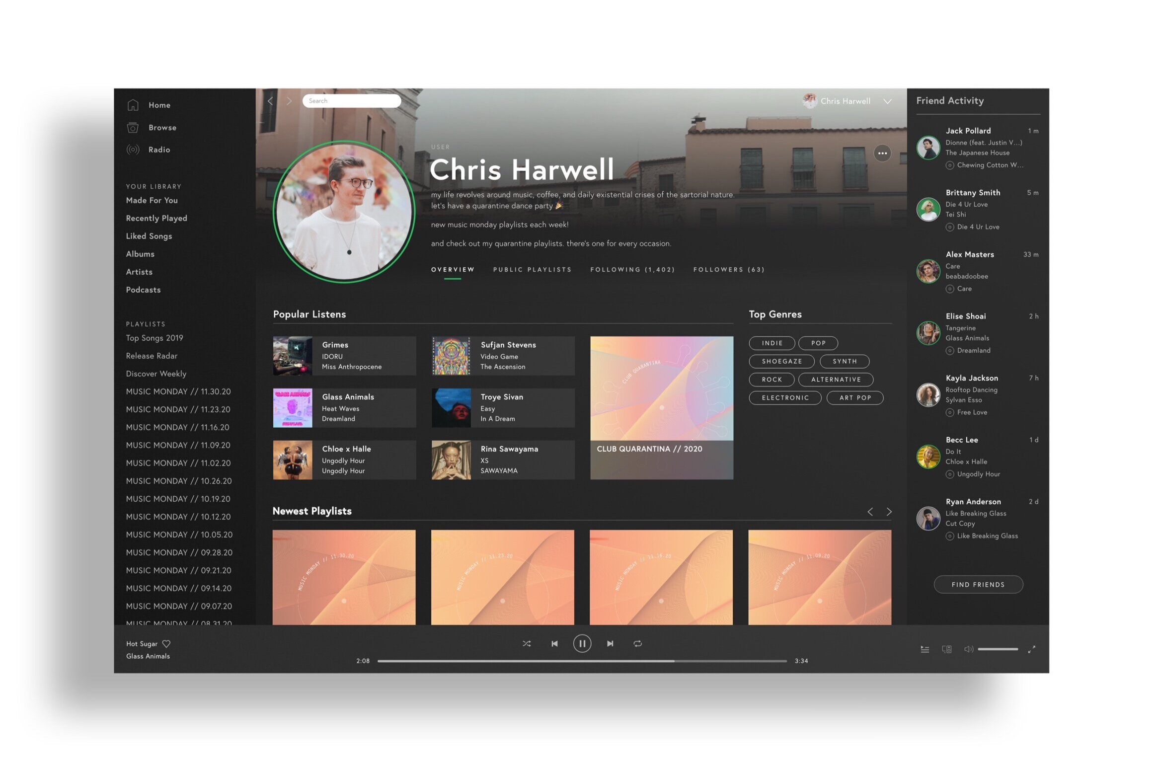
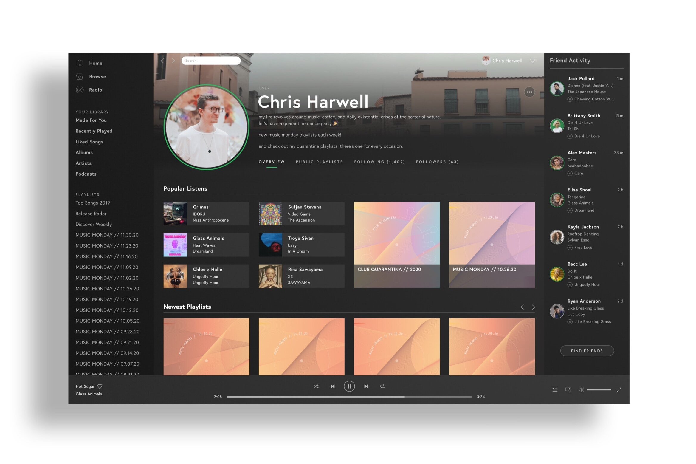
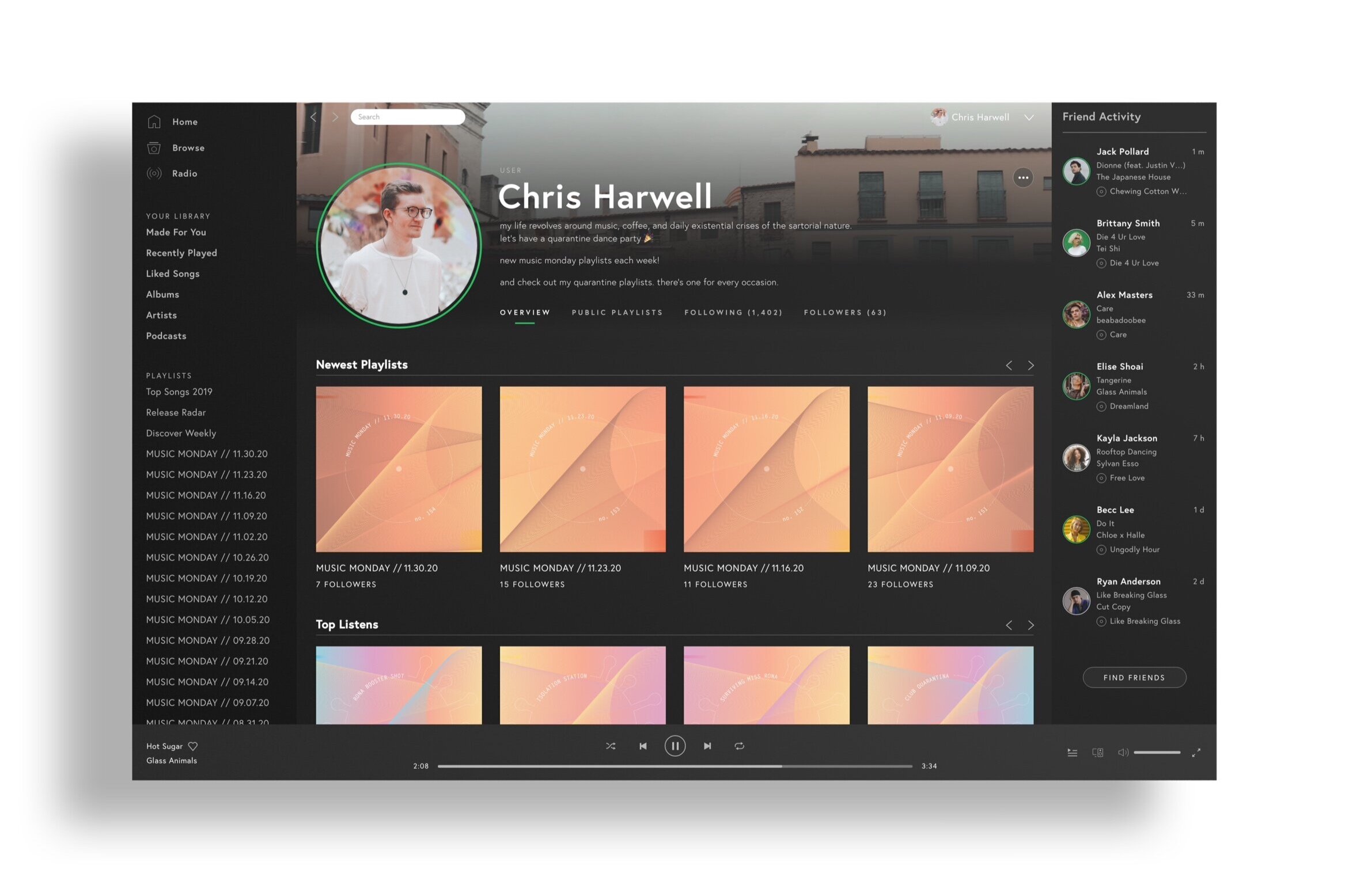
Spotify Social.
Redefining music sharing and discovery.

Show Off Your Taste.
Highlight your popular listens, top genres, and immaculately curated playlists.
Check On Your Friends.
See what your friends are listening to and share your currents faves with your top friends. It’s as simple as dragging and dropping.
Add Personality to Your Profile.
Choose from a variety of content blocks to showcase your unique style and promote discovery of the music and playlists you love the best.
Before and After.
Social Features
Increased the prominence of the profile picture and accompanying information
Added “Stories” functionality in line with Spotify trends
Added option for background image and description for increased personalization
Visual Design
Worked within Spotify’s existing design system to build out new features
Rebalanced the information on the page while maintaining visual hierarchy
Experience
Enhanced customization and discovery through the development of new content blocks
Allowed for personalization through a readily-scalable format/solution
Moving Forward.
The work is never done. Spotify’s interface is very intricate. The workflow consists of quite an extensive array of pages and features, so it felt daunting at time to take on this redesign. I worked my way through methodically, but I imagine I’ll continue finding some design decisions I made that I could very well improve upon. Catch me back here on a constant basis, I guess!
Giving back is cool. I’m considering compiling my working file into a UI kit, should anyone else wish to try their hand at this project. Although, I’m somewhat concerned about IP infringement…so maybe just a style guide.
I’ll be back. While reimagining Spotify’s desktop experience to be more socially-oriented, mobile evolution was beyond the original scope of this project. I’d love to tackle mobile functionality next.
UI/UX
Looking for more?
Check out some of my other work spanning UI/UX, Visual, and Interaction design.


